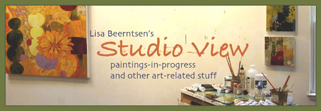
new 'banner' in the works
I'm working on a new header which will bring back the true name of my blog, 'studio view'... which is important. I can see I need bigger darker type where the blue is, and a dark border. Or to re-think the whole thing. 
I've always liked the photos in artbooks which are labeled 'studio view' --where you get a peek of the art in the environment it's created in. I'll be scanning in some favorites in the future.

I've always liked the photos in artbooks which are labeled 'studio view' --where you get a peek of the art in the environment it's created in. I'll be scanning in some favorites in the future.


0 Comments:
Post a Comment
<< Home